
Brand: TollGuru
Duration: One week | 2019 (This is a fast design challenge)
–––––––––––––––––––––––––––––––––––––––––––––––––––––––––––––––––––––––––––––––––––––
TollGuru is an app that allows users to compare routes for tolls, gas costs, and time across all toll roads, tunnels, bridges, turnpikes, and tollways in the USA, Canada, Mexico, and India for cars, trucks, trailers, RV, bus, and motorcycles. It aims to empower users to find the cheapest, fastest, and preferred routes for upcoming trips.
–––––––––––––––––––––––––––––––––––––––––––––––––––––––––––––––––––––––––––––––––––––
The Problem
While TollGuru provides very useful functionality, the poor UX/UI design of the app limits its potential. In the Google app store, we see user reviews such as
“not user friendly enough”
“ App works but interface is so wonky it makes it frustrating to use”
This redesign aims to create a more user-friendly experience and clean user interface in order to enhance the useful functionality TollGuru has. Specifically, this project focused on the "Enter Trip Information" section of the whole system.
MY ROLE
This is a fast one-week redesign challenge. Throughout the process, I worked as a solo UX/UI designer.
The CHALLENGE
To keep the scope in the “Enter Trip Information” section, it was a big challenge for me to clean up the app’s UX flow without expanding too many other features or branches.
––––––––––––––––––––––––––––––––––––––––––––––––––––––––––––––––––––––––––––––––––––––
KICK OFF: DESIGN PROBLEMS
Poor UX Flow & UI Decisions
• Confusing start process without specific instructions
• A flat and unclear information architecture makes the app hard to navigate
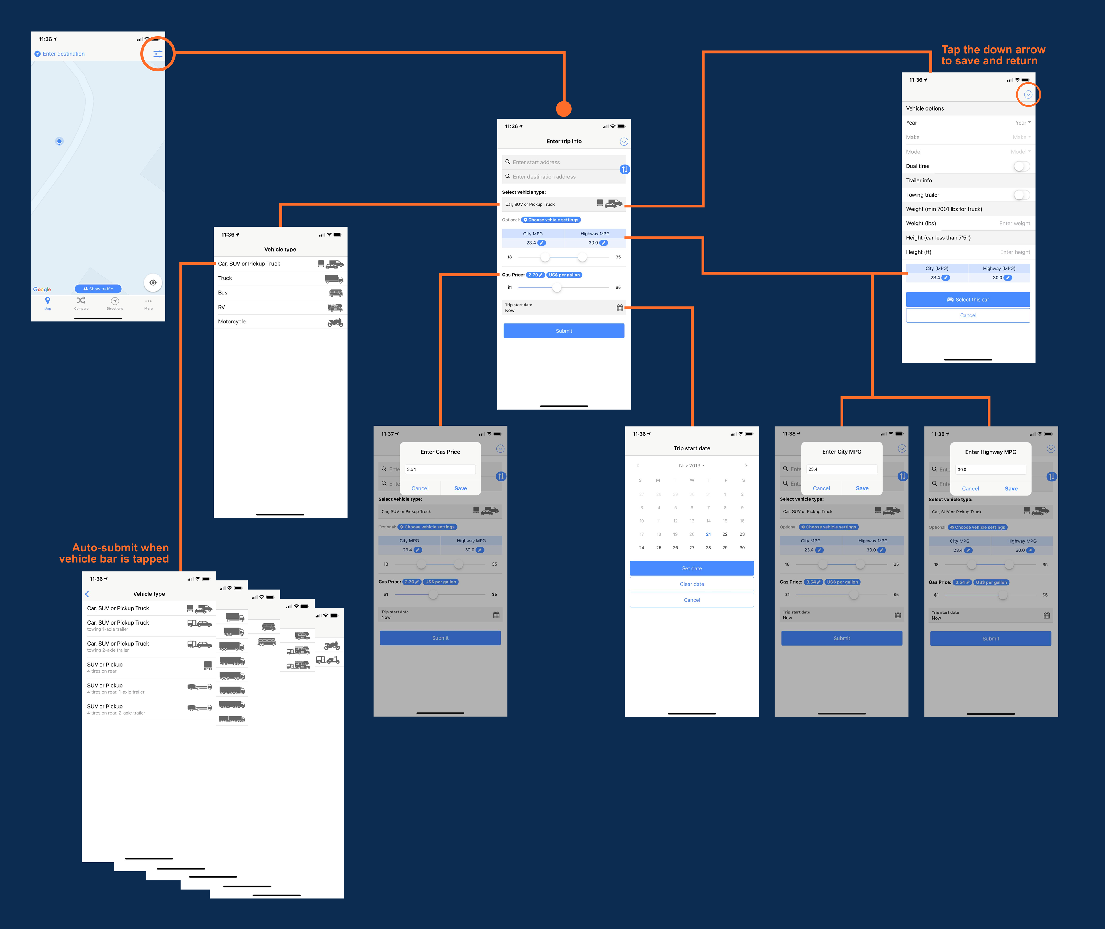
Current UX flow of the "Enter Trip Information" section
• UI elements didn’t match with the represented functionalities
• Unclear interactive elements
• No feedback after interactions
• Cluttered information without a clear hierarchy
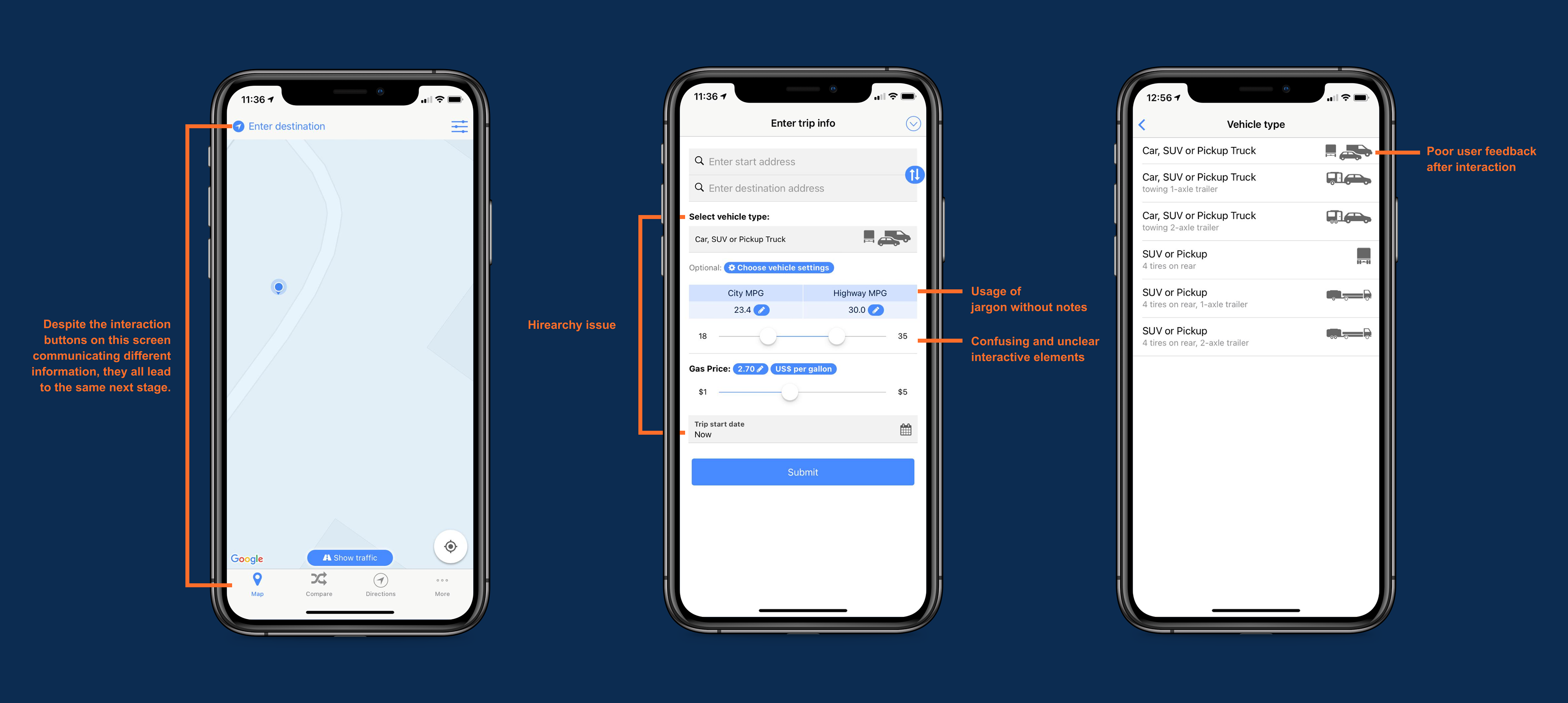
Current screens in the "Enter Trip Information" Section
THE SCENARIO
Khamla Pinkeo from Laos is planning a road trip with two of her friends. Before the trip, they want to plan the whole trip as much as possible and try to decide what kind of vehicle they want to rent for the trip to be the most cost-efficient. They have never been to the United States before, so they are unfamiliar with both the language and the currency.
THE USER'S NEEDS
• A system that is easy to understand and navigate without relying too much on language
• A tool that can help users understand local currency value in a unfamiliar country
• Ability to plan and prepare for a trip before departure
• A tool that can help users who do not own a vehicle make better decisions on vehicle options
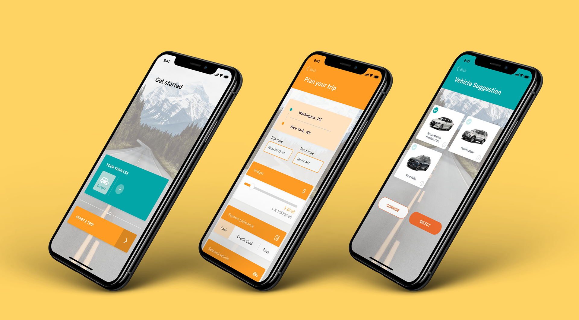
THE REDESIGN
A better road trip planning experience
Instead of presenting all the cluttered information at once, the new design will lead users to information with a clear hierarchy to prevent confusion. Using two different color themes for different sections as part of the navigation system allows users to navigate and understand where they are in the system easily.
• Orange theme — Trip-related screens
• Sea green theme — Vehicle-related screens
FEATURE 1
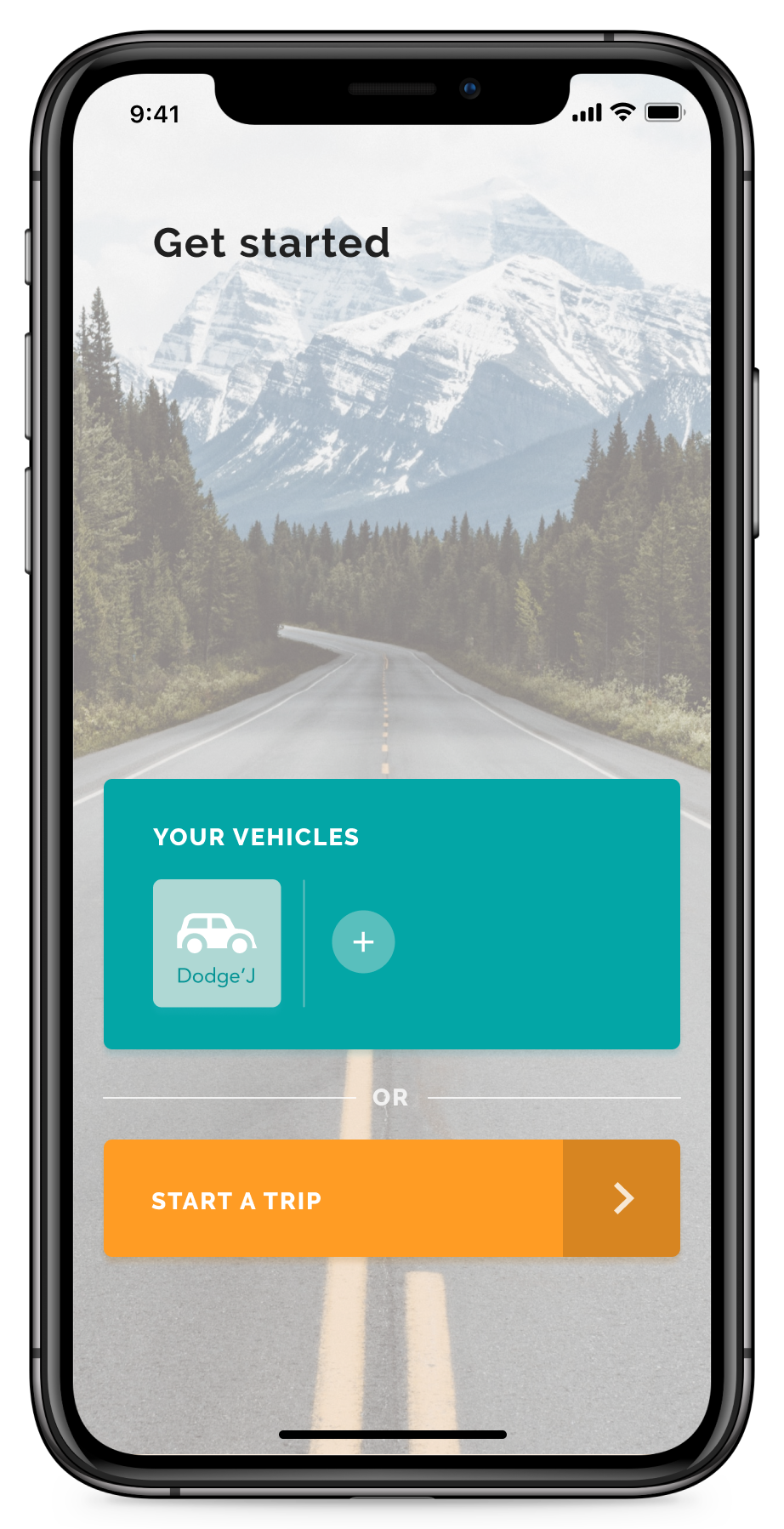
Add Your Vehicle
Users can log in and save their vehicle information before a trip in order to speed up the process when planning a new trip. This feature is handy for return users who own more than one vehicle.
FEATURE 2
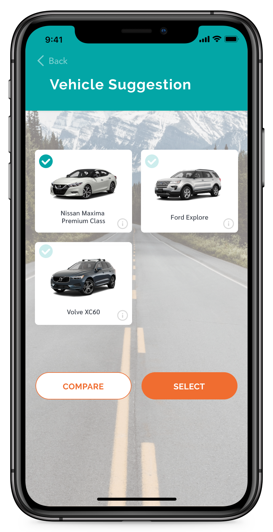
Vehicle Suggestion
If you don't own a vehicle and don’t know which one to rent, don’t worry! Our vehicle suggestion feature can help you compare the vehicle options to find the perfect fit based on your needs and preferences.
FEATURE 3
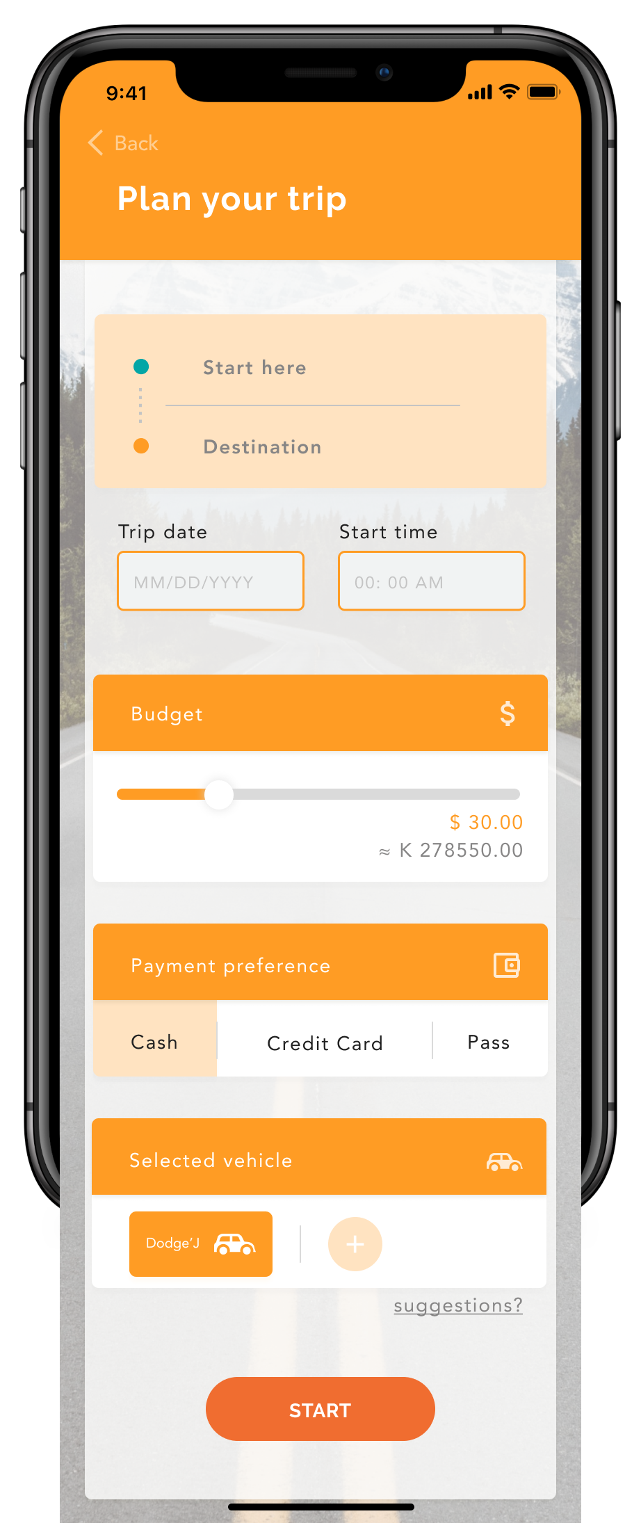
Easy and Personalized Process
We walk you through the planning process and give you personalization options, such as currency conversion and payment preferences. If you added your vehicle before planning the trip, you can select the preferred vehicle from your saved collection.
Presenting — The New TollGuru
• Scenario 1.1 — A new user just logged in. They choose to add their vehicle and start to plan their trip.
• Scenario 1.2 — A user can add their vehicle information and come back to plan their trip later.
• Scenario 2 — A new user just logged in. And they choose to start the planning of their trip right away.
REFLECTIONS & TAKEAWAYS
• Clarity is top priority. During my first round of the redesign process, I tried to change the entire system, which led to a confusing and unclear UX flow. The project was out of scope under the tight deadline and it gave me a difficult time moving forward. Through this project, I realized how important it is to keep users’ needs in mind and prioritize features during development.
• Keep it simple. Sometimes as designers, it's tempting to make things overly complicated. The tight project timeline forced me to pay attention to the most important things and understand that keeping things simple sometimes is the secret to building a more user-friendly system.