
Brand: International Family Union
Duration: Five months | 2019–2020
International Family Union (IFU) is a non-governmental organization actively connecting and serving international students and their families from various aspects. Its social mission is to make overseas campus life safer and to keep the parents informed of emergencies.
––––––––––––––––––––––––––––––––––––––––––––––––––––––––––––––––––––––––––––––––––––––
The Problem
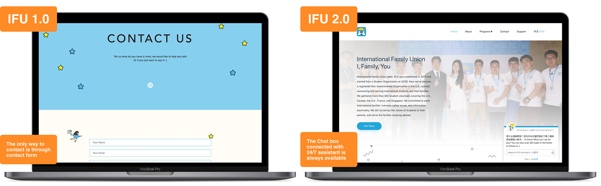
As International Family Union continued to grow, they needed to build a more reputable website to help international families across all fields with a stronger NGO branding.
THE TEAM & MY ROLE
I worked as a product designer leading the design process and connecting with external and internal shareholders.
We were a global virtual design team, with one copywriter/assistant (Wanwei Huang), one more designer (Daisy Li) other than me, and two developers (Yutao Ma, Eric Chen).
In this project, I led the user research, prototyping, usability tests, and iterations. Daisy Li and I worked closely with the developers to implement the design solutions. In addition, I assisted our copywriter in cleaning up and making sure the content met our users' needs and expectations.
The CHALLENGE
Since we are a virtual team and most of us are part-time volunteers for the project, it was harder to manage the timeline and overall plan. As an in-house design team, new tasks were popping up frequently, therefore we had to learn how to prioritize and keep the scope.
––––––––––––––––––––––––––––––––––––––––––––––––––––––––––––––––––––––––––––––––––––––
Kick Off
Insights from the data
By analyzing data that we collected via google analytics, we found that the website had low traffic, little interaction, and a high bounce rate.
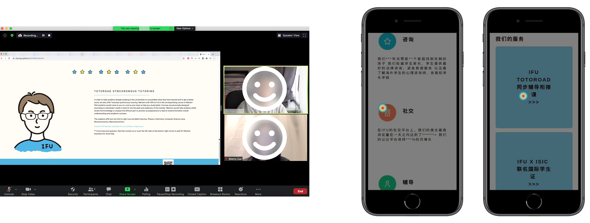
IFU 1.0 Usability Test & IFU 1.0 Homepage Heat Map
Learn from both quantitative and qualitative information to find the cause of low traffic and interaction
To upgrade the digital branding of IFU and keep users engaged on our website, we applied a heat map and conducted interviews with 8 usability tests. In those usability tests, we found users who matched our targeted personas and gave each of them a scenario.
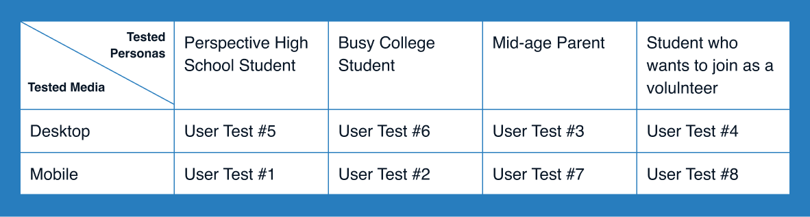
Usability Test Info
The Discovery
Navigate with similar questions in mind
On mobile, we observed that users struggled to navigate the website and were confused by some design elements. Even though our users could navigate on desktop smoothly and comprehend the general information, all users revealed that the most critical things were to verify the trustability of the organization and find out what it has to offer.
“There’s not much detailed information, and the graphics make the website look like something for kindergarten kids...”
According to the usability test results, 50% of the users explicitly pointed out that they felt the website conveyed a low sense of trustability. We identified some common frustrations and wishes among our users.
Inefficient Information
62.5% of users expressed that the website was too wordy, and that they want to have more detailed yet digestible information.
Ambiguous Design
75% of users had trouble interacting with some design elements, including the mobile navigation, banner button, sign up call-to-action, etc.
Indirect Instruction
75% of users wished there was a more direct way to contact the organization, or instructions on participating in the services that IFU offers.
“IDEAL” TRAVEL PATH THAT USERS HAD IN MIND
Enter - Trustability - Offering - Details - Contact - Exist
Through user interviews and behavioral observations, we identified a rank of questions that users held when they visited the website. (From 1 to 4 in the order of priority, 1 is the highest)
1. How trustworthy is this organization?
2. Overall what does the organization do, and what can they offer to meet my needs?
3. What exactly are the services they are talking about?
4. How can I access their services? How can I contact them?
REFRAMING THE PROBLEM
A low sense of trust caused by vector-based graphics and lack of information exacerbated low traffic and interaction problems. Low interaction was due to inefficient information, ambiguous design, and indirect instructions that led to confusion for users. There was no way to directly access detailed information or participate further, which led users to become frustrated and drop off the site.
How might we design a more trustworthy, informative, and concise website that meets our users’ needs across all fields?
Those findings made us ask how we might design a more trustworthy, informative, yet concise website that meets our users’ needs across all fields. We then proposed a redesign that will provide an all-in-one solution to the problem.
THE REDESIGN PROCESS
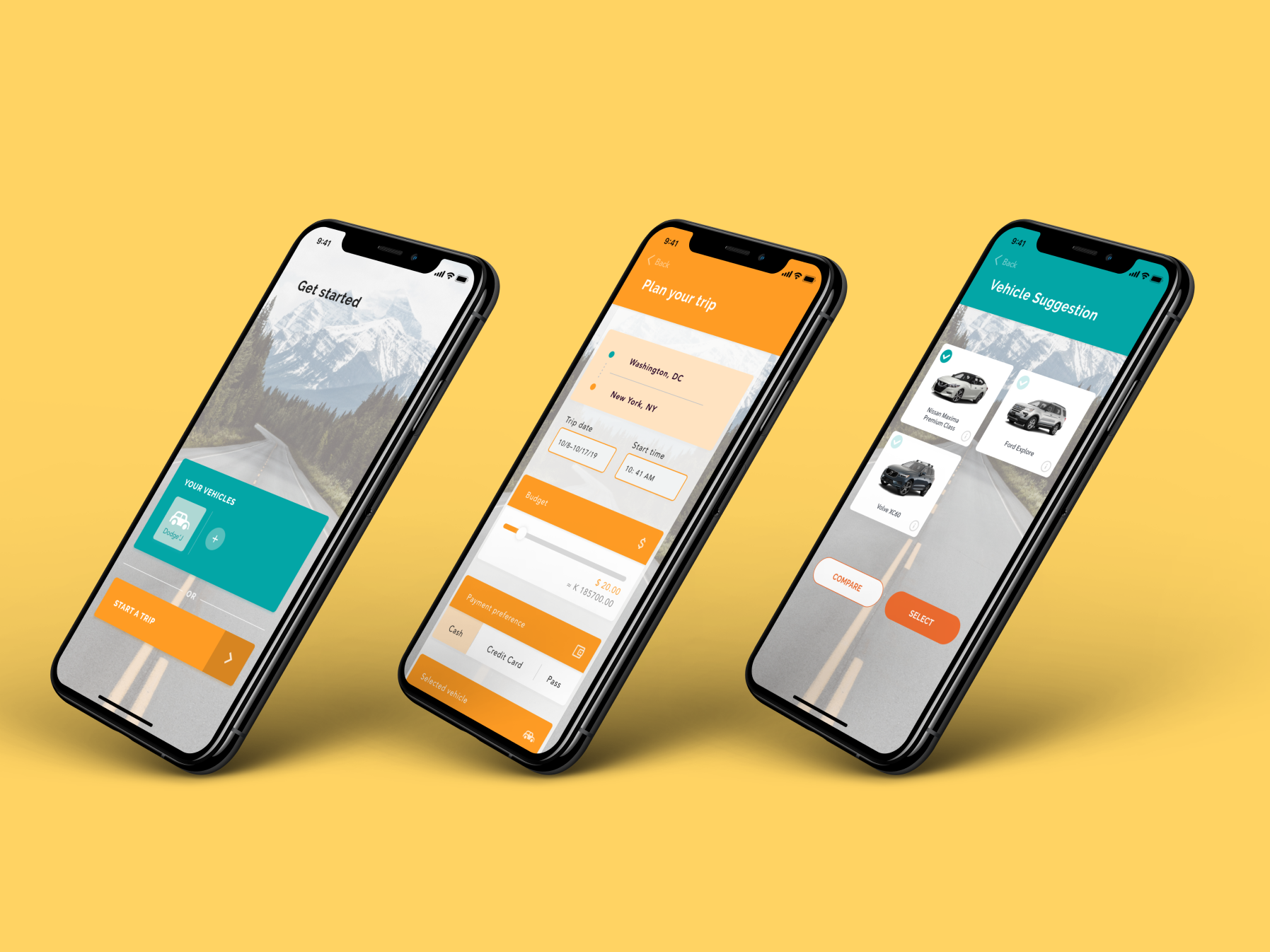
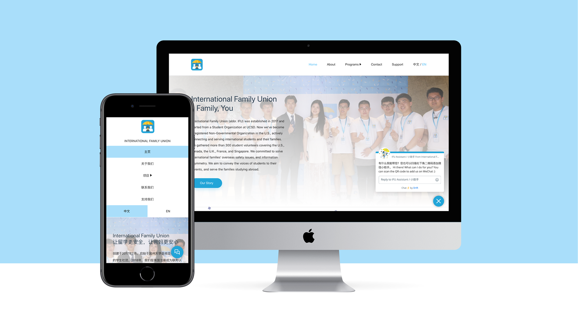
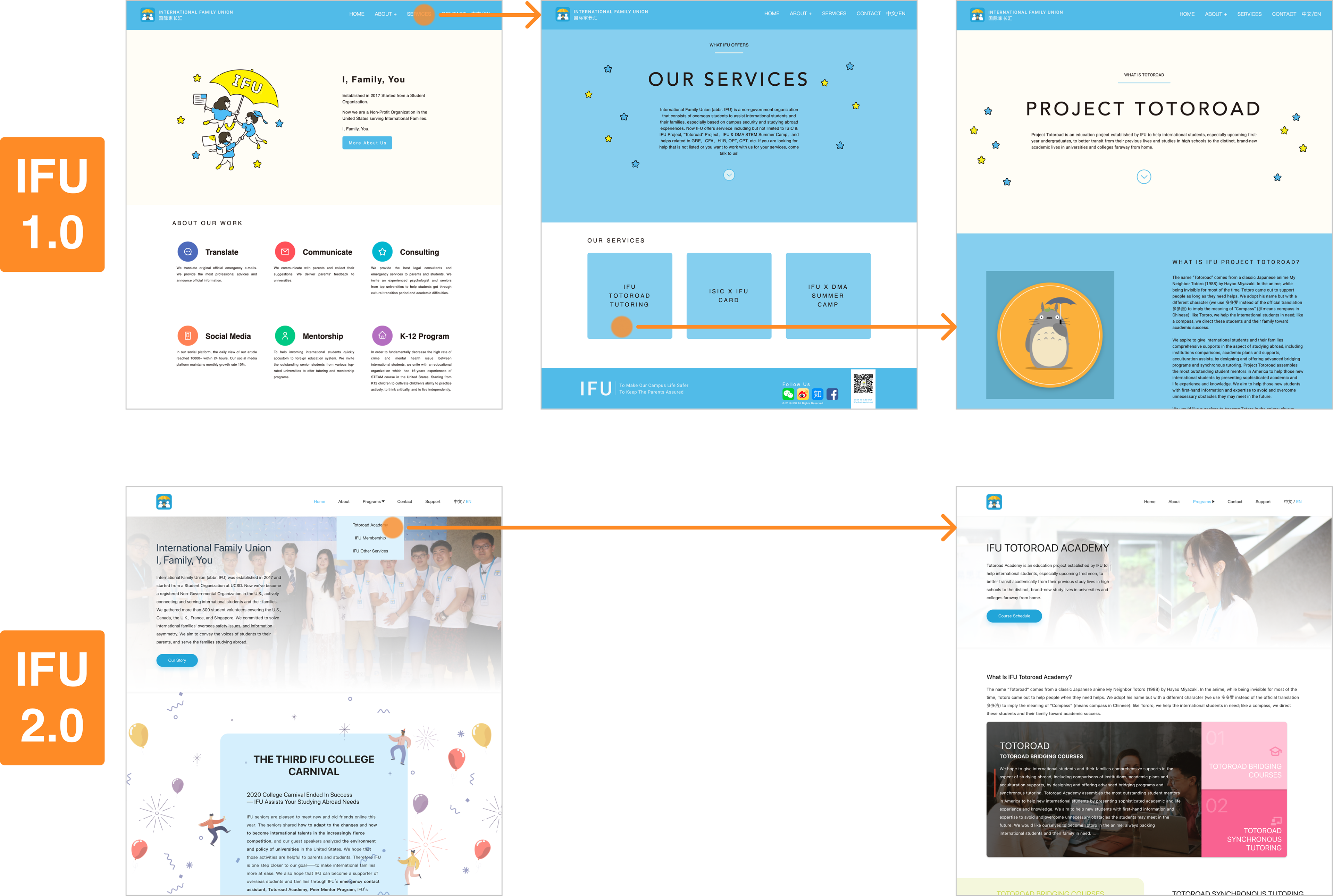
Introducing IFU 2.0—the All-in-One Solution
As IFU is communicating with a wide range of audiences, IFU 2.0 provides users with an all-in-one solution to meet their needs across fields. This solution also makes it easier for users to learn about IFU and participate in offered services. Meanwhile, it serves as a tool that helps IFU’s internal departments connect with their target audiences to hit the goals.
Get to know IFU from different angles
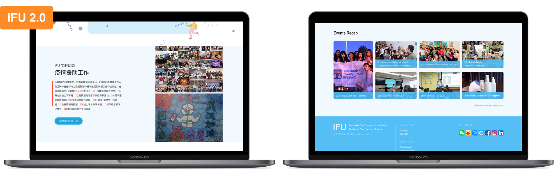
For new users who know nothing about International Family Union, IFU 2.0 presents the organization’s work in more dynamic ways with photos, data, stories, etc. We give you various options to pick and learn about IFU.
We’ve cleared your navigation path
In the past, you might get lost in navigating the website. IFU 2.0 presents a clean navigation system with a straightforward dropdown menu. We help you to find what you want with fewer clicks.
We’re ready to help
Sometimes you get confused or just want to talk to someone to save time. We have you covered! A live chat box connected with our assistants 24/7 allows you to send your questions or inquiries right away. You have a personal IFU assistant within reach at the bottom right corner on IFU 2.0.
During the redesign process, we also made some decisions to help our internal departments and to fulfill the organization’s needs.
Get involved and revisit again
To increase the interaction rate, we implemented more call-to-action instructions and useful information to convert new users to returned users.
We’re trustworthy and we do real work
To eliminate users’ skepticism, IFU 2.0 tells stories with proofs of details in a “case study” format. It shows the public that we’re trustworthy by presenting facts regarding our works and the communities gathered around IFU.
HOW DID WE GET THERE
Build the trust, knowledge, and connections
Three questions drove my design strategies and decisions:
1. What factors have an impact on users’ evaluation toward trustworthiness?
2. How will different target audiences (tech-savvy students vs. non-tech-savvy parents) respond to various design elements?
3. What components will affect the website’s retention rate?
Build trust by showing photos presenting our values
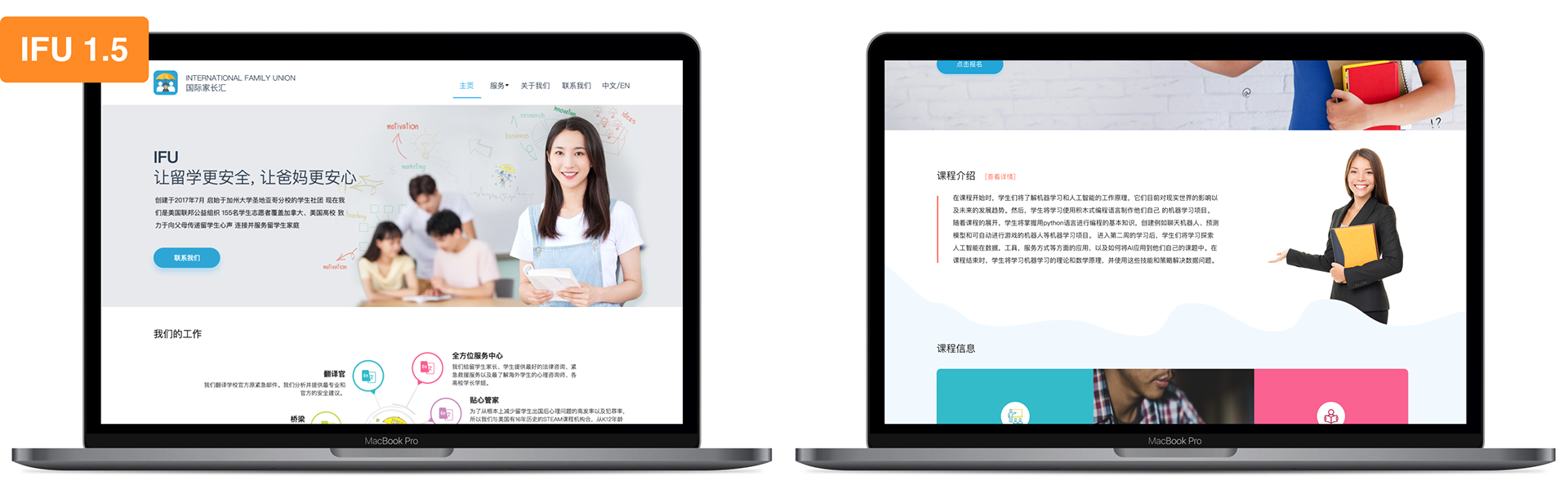
During usability tests, we’ve learned from our users that on IFU 1.0, they couldn’t feel anything tangible since all the visuals are vector-based graphics, which led to a low sense of trust.
As users explicitly expressed, they want to see photos or some media that present a story. For us to meet this users’ need, another challenge came up. We didn’t have many photo assets. Working as a virtual global team makes it even harder to collect photos, not even thinking about high-quality style-consistent photos. Then we decided to use stock images.
The stock-image approach didn’t work out since we were still getting comments such as
“... don’t feel a sense of community”
“... are you a (for-profit) study abroad agency?”
This certainly didn’t reflect our value and brand well.
We step back to reevaluate our purpose of using photos—to show our value, and asked what is that value that we want to convey?—It’s the sense of community. We realized that we couldn’t bypass the lack of asset problems.
Therefore we reached out to other departments, especially our volunteer teams. We made an announcement and pointed out the importance of collecting “evidence” of moments that present our values to build our NGO branding. Throughout the year, we worked together with all departments to deliver the community experience to users, even when they just land on our website.
Build knowledge by leading users to find info easier
As our users’ knowledge levels with technology vary widely, we had to ask ourselves.
How could we drive our users’ attention to find the information they need?
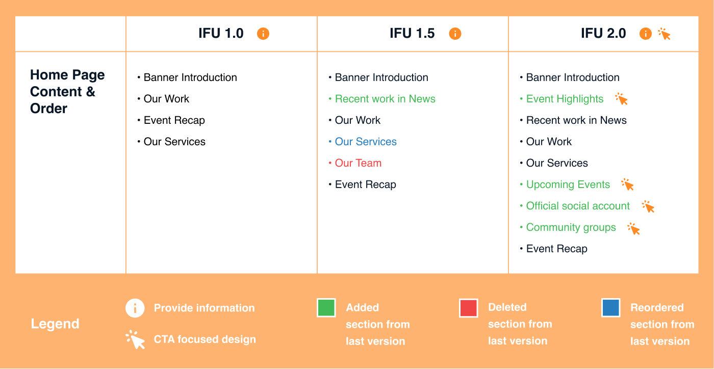
In IFU 1.0, we had this layer-within-layer information structure that our users had to travel to the third tier in the structure to access any information of our specific programs. We were losing users during the travel process. According to user behaviors’ data on google analytics, most users stayed on the home page and rarely interacted with other pages. This data also indicated that users might drop the site even before they reach important information such as our program-related info.
To optimize our users’ experience navigating the website, we implemented a more straightforward navigation system to eliminate the confusion about “hidden” navigation. Instead of presenting all the program information at once, on IFU 2.0, we only give pieces of overall information on the home page for users to learn the large picture. This way, the home page functions as an index with short general information, which can lead the users to dive deeper and read more if they’re actually interested.
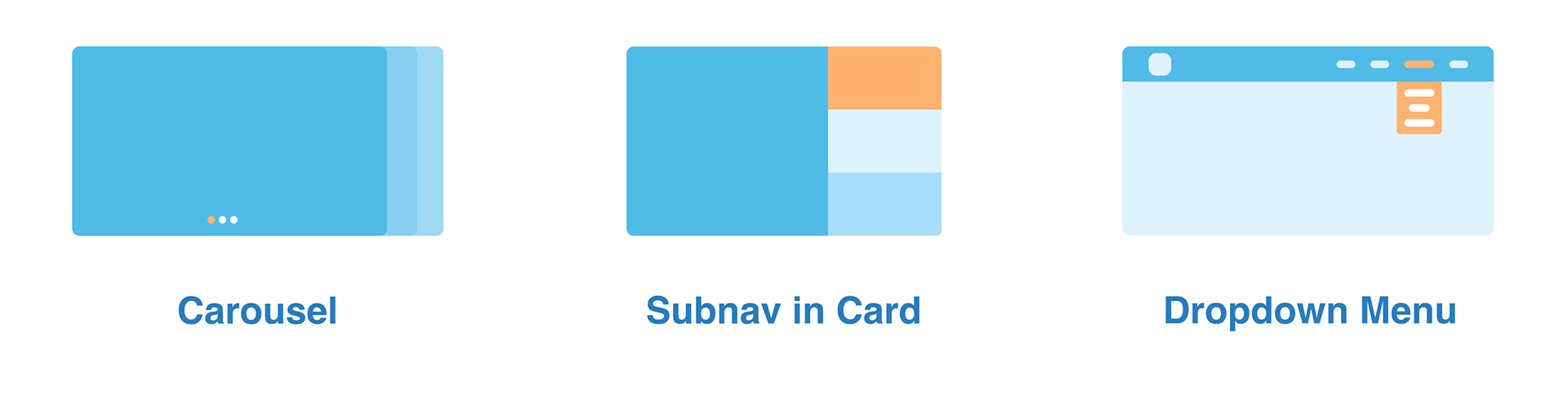
To avoid overwhelming design elements for our users, during usability tests, we presented and observed how users interact with different design patterns. This method allowed us to filter out those more predictable and established patterns, those even non-tech-savvy user groups can understand without any problem.
Build connections by inviting users to interact with functions that met their needs
In order to build relationships with our users, first, we needed to understand why they would want to connect with us? This led to another essential question:
What are our users looking for?
According to the insights that we learned from the usability tests, we remapped the amount and the order of information presented on the home page, where users spent most of their time at. We wanted to keep our users’ attention by demonstrating that we can meet their needs right after they entered the website.
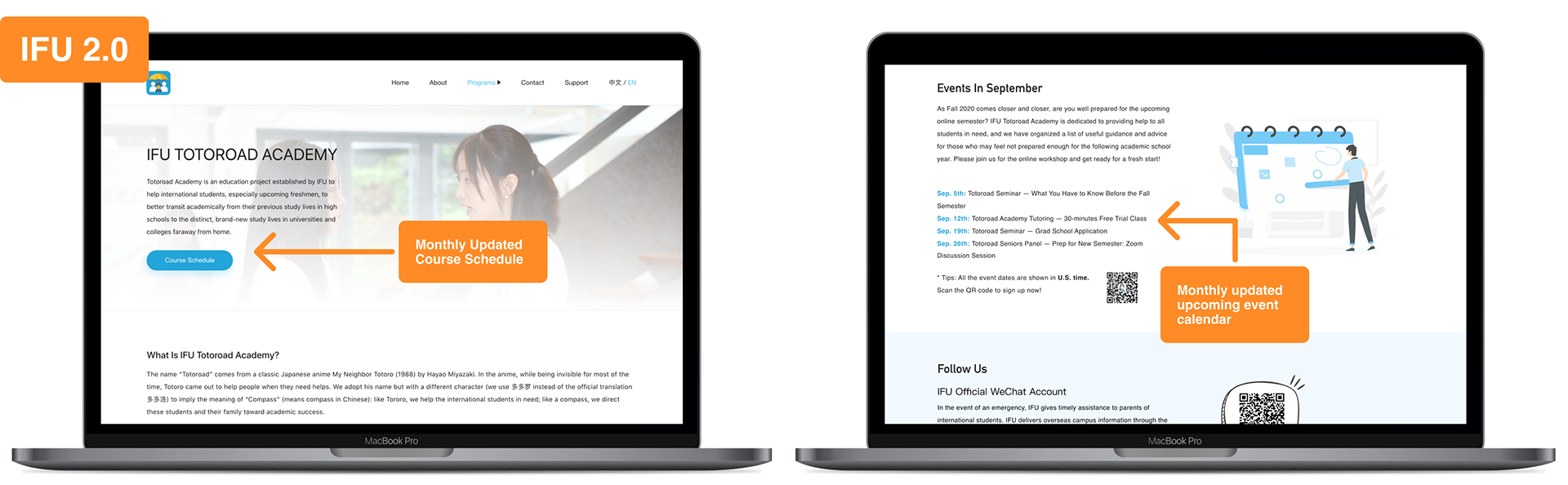
Another aspect of connection is interaction. To improve the overall interaction rate, we implemented various call-to-actions for users to involve with. And by providing useful information, such as monthly updated course and event schedules, we want to attract our users to save the website as a bookmark and revisit it again in the future.
According to users’ “need rank”, after finding the information they need, the next thing they will look for is the contact method. By adding the chat box feature, users will know how to contact us right after landing on the website, which saves users time and effort to find how to contact.
THE IMPACT
The redesign of the International Family Union’s website has positively impacted trustability, based on post-redesign usability tests conducted with the same user groups for the pre-redesign usability tests. According to user feedback, even though the target audiences of our services seemed still not clear enough, we received positive feedback toward the redesign overall. The confusion of our target audiences revealed the critical role copywriting is playing in the process of improving user experience, which will be one of our next focus points moving forward.
• 87.5% of users preferred IFU 2.0 and, without any prompt question, they stated that they feel an increase in sense of trust and community after the redesign.
• 87.5% of users agreed that after the redesign, the website is cleaner and more informative.
• 62.5% of users liked the chat box function and agreed it is helpful when they need to contact the organization.
• 50% of users explicitly indicated that they like the new navigation system, which is cleaner and easier for them to find the information they want.
Takeaways & What's next?
Since working on IFU's design team remotely for over a year now, I have learned and figured out how to become a better product designer, project manager, and digital creative director. I joined the organization in May 2019 as a solo product designer after reaching out to the founder for my entrepreneurship project. Since then, I started to recruit other designers and brought them on-board for the organization's website. We started from scratch, and along the way, I have grown so much from production to leadership. Even though I don't have any mentor in the organization to lead my way, I expanded my network and reached out to other professionals in the design communities for advice and mentorship, and then I took that knowledge back for adaptation. Therefore, I am thankful for this opportunity in which I got to learn and practice these values. Here are some key takeaways that I learned during the process:
• It's harder to build the team than build the design. The core of a design team is its people. Ideas are just ideas. We need the right talents and a team with a great work environment/culture to turn ideas into reality.
• Get to know teammates as people first. To have a high-performance team, we need to build trust between team members and form the bonds before starting to talk about professional tasks. This way, the team is more energetic, and people on the team have a sense of belongingness and ownership of their work.
• It's essential to have objectives in mind. We tend to obsess over too many little details while working. But no matter what we do, having goals set in our minds helps the team focus on priorities and design for users and different stakeholders instead of just the look.
• Collaborate with other departments strategically. The design department requires lots of collaboration and support from cross-functional teams in the organization. To have other departments help us achieve our goals, we need to think from their perspectives. Setting a plan with the same objectives will enable departments to work with us more efficiently.
We're still learning how to work together as a better team, and I'm still learning how to lead and serve everyone on the team better for them to shine. We are currently changing up our workflows for a more structured and manageable system. And we are also trying to bring data and analysis into our design process and find the right talents on-board.